Before I create my own magazine, I need to research music magazines that are already around, this helps me with creating my own as I have a better understanding of what conventions and typical music magazine features I would need to include in my magazine
NME Magazine
Genre: Indie, Rock and Alternative
Audience: Teenagers, Young adults (older adults might be interested in
this magazine, if interested in these particular genres)
Management
Eric Fuller: Publisher
News/JournalismConor McNicholas
This magazine shows:
Bold Masthead: Used to make the magazine stand out. NME wrote in a bold colour, empathises this. Placed in the top left hand corner makes it easier to see/find for the buyer. The only bad point about the masthead is that 'NME' is an abbreviation of the name 'New Musical Express' some people might not know this.
Main Cover Story: Takes up the majority of the page, bold coloured writing to attract reader. Picture based on genre of magazine. Mainly 'unnusual' images are used to give the magazine edge.
Cover Lines: In this example, they use a colour theme of red and white. This gives you an impression of what will be in the magazine, which attracts the buyer. Normally catchy phrases or a few words would be used to grab someones attention.
This magazine would compete with other magazines such as Q or Mojo as they both focus on the same music genres and also the same audience. This magazine would be one of the main ones I would focus on as I plan on basing my magazine on the same genres.
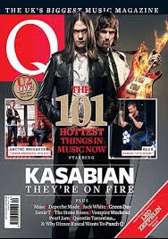
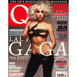
Q MAGAZINE
Genre: Indie, Alternative
Audience: Teenagers, Young adults (typically all fans of these genres of music
Editor: Paul Rees
This magazine shows:
- Bold Heading : However the one letter heading with a bold box around it makes it quite brief but also very effective when it comes to standing out. I like this idea a lot, I might incorporate this idea into my own magazine.
- Main Image: The main images is very bold and quite out there. This particular image is quite prerogative, this creates a 'out there' look and may add a unique feel to this magazine. A disadvantage to this effect is that some people may find it offensive or too revealing.
- Language: The type of language that has been used is easy to understand and also quite humorous.I have found that most music magazines use a lot of humour in their writing.
- Font : Bold, Simple font - makes it easier to read.
Q Magazine is a magazine that would compete against NME. As they are both based on the same music genres, they show a lot of the same compounds. I would definitely look at these two magazines in more detail, to help me with the production of my own magazine.
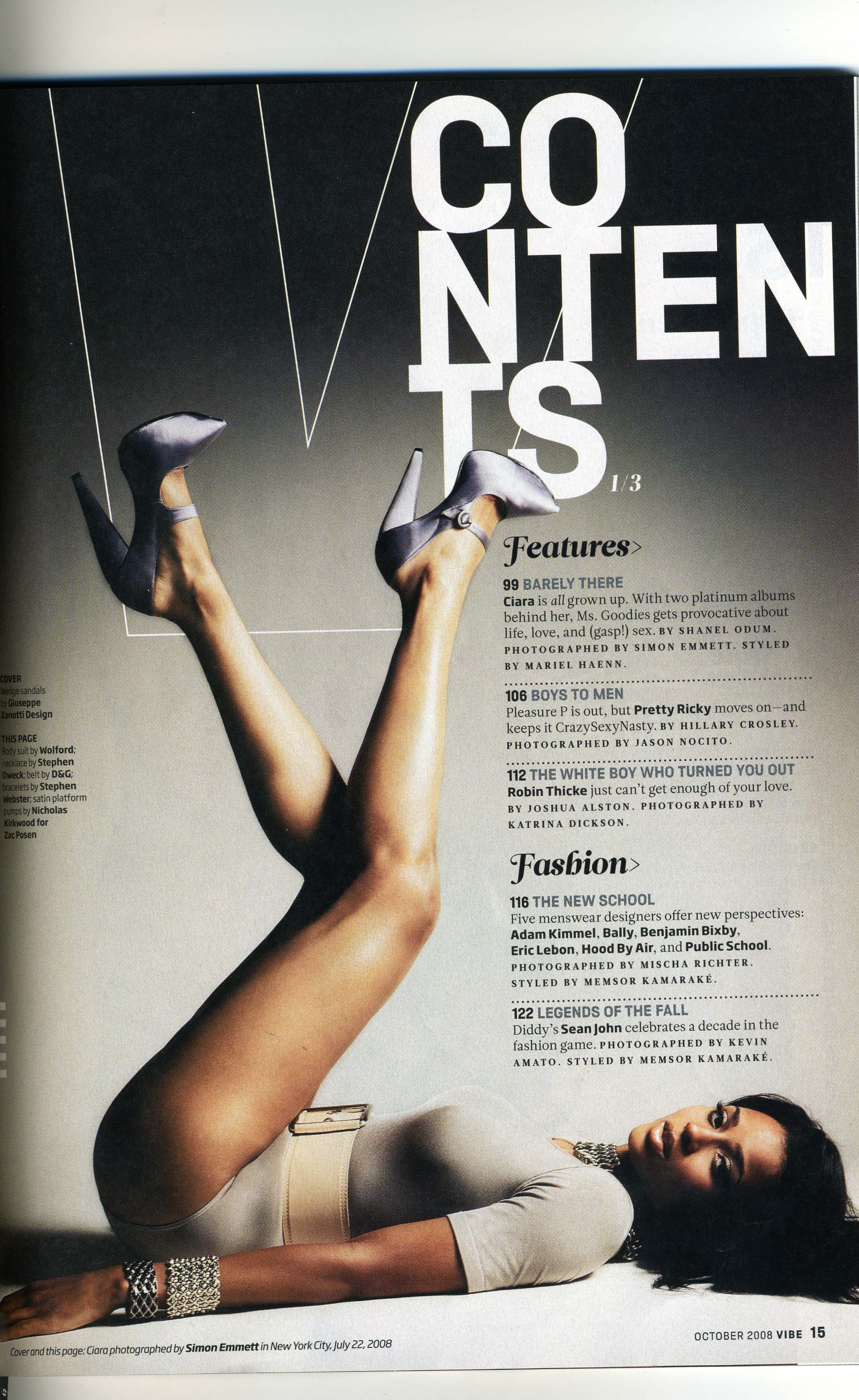
VIBE
Genre: Hip Hop , Rap, Grime
Audience : Teenagers and Adults. People who show an interest in this genre of music.
This magazine shows :
Masthead : The masthead has been placed in the upper middle part of the page, just behind the main picture. This positioning makes it easier to see,which attracts the buyer. I think the masthead is boring and plain, but the main reason for this is to make it easier to read, which in the long run is better.
Font : Bold and simple.
Layout : There is a main picture ( like most magazine covers ) I feel as if this cover is quite boring. In my opinion I would say this wouldn't attract my attention or make me want to buy it.
This magazine is different to the above ones. For starters it shows a different genre and also it appeals to a different group of people. I personally will not be focusing on this genre for my print work.
TOP OF THE POPS
Genre : Pop
Audience: Children, mainly female.
This magazine shows :
- Masthead: Hardly visible, if you are familiar with this magazine you will know what the name is.
- Layout: The layout is quite busy, your eyes don't focus on one particular images. Although there is a main images, your eyes are drawn away from it because of the masses of writing. This gives you a hint of the age range/audience the magazine is appealing to.
- Font: Bubble writing for the masthead creates a younger more childish effect to the magazine. The other fonts that have been used are quite plain and easier to read.
- Colour Themes: Girly colours have been used, mainly yellows and pinks. This type of colour themes, I will not be including in my magazine.