To help me in the best possible way achieve a well created magazine, I need to make sure I use all codes and conventions and also make sure they're right. To do this I'm going to focus on magazines of the same genre to see if they use the same codes and conventions.
INDIE GENRE
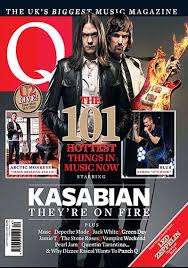

- Both magazines include a bold masthead, which uses the same colour scheme red and white. Also they have both located it at the top left hand side of the page.
- They include a 'plus' section on the front cover, with this they both only simply include band and singer names, there isn't any other detail in the plus section other than that.
- There main cover story : Their images have both been placed in the middle. Also again they both keep the colour scheme simple with blacks, whites and reds.
- In this issue NME have included that there is a 'free poster' section within the magazine. Q also does this. Both magazines have been known to have freebies or include posters or demo CD's to atract the buyer. This is something I would consider including for my magazine.
- Both use bold fonts for everything to make the words stand out.
ROCK GENRE

No comments:
Post a Comment