Every magazine, no matter what genre it is, has a contents page inside. This is too help the reader find particular stories and pages they want to look at inside the magazine. This is helpful and also makes it easier for the reader to find what they are looking for. By researching other magazines contents pages, it gives me an example of how mine should look.
INDIE GENRE


- Both these magazines keep their colour theme simple, with dark reds, greys and blacks.
- The layouts are pretty similar, as both have the majority of the page filled with writing and also pictures. They both have a main image, which they caption with the page number- this helps draw the attention of the reader to that page.
- Both contents have been broken up into sections such as 'Review' 'Features' etc This would be something to consider when making my own magazine. This gives more information to the reader.
- Also both have bold headings at the top indicating that the page is a contents page, with added captions like 'NME this week' or 'Q Contents'. Within the bold heading, they both have included the date.
- NME includes a short article about the picture they have included and also advertisement.
I like how busy the page looks, to me it suggests that there is a lot in the magazine, which I feel helps to sell it more. It gives me the impression that you get a lot for your money.
RAP/ HIP-HOP/ GRIME GENRE
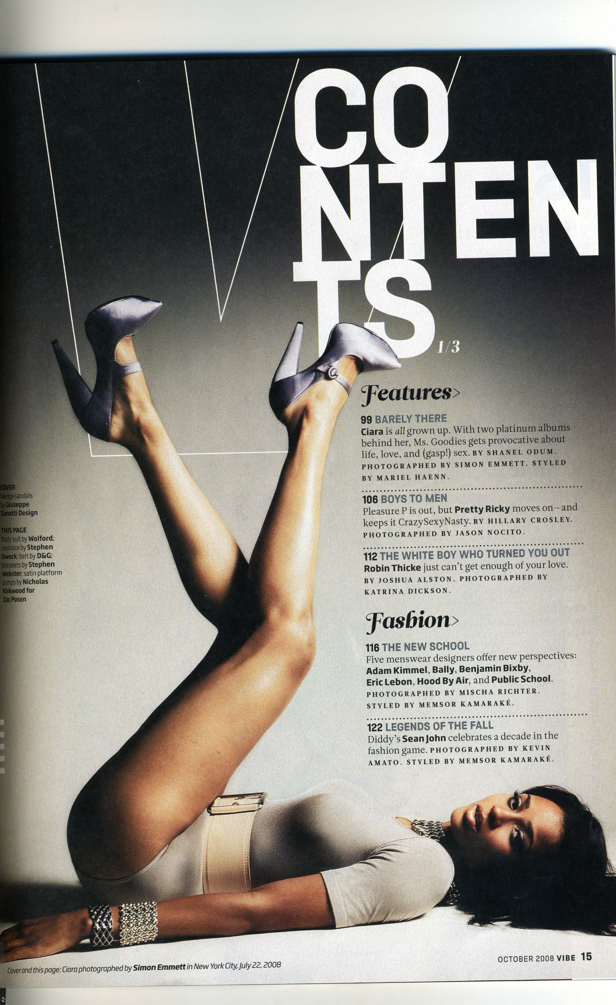
- This is the complete opposite to the indie/rock magazine contents pages as there is only one image, which I would say is quite prerogative. This creates a different look to the other magazines, how ever I feel it matches the genre of this magazine very well.
- I would say they're isn't a lot of writing, I personally don't think this is a good thing, as it suggests they're isn't much in the magazine itself.
- The heading is in white and bold, which stands out on the grey back ground. I like how they used a outline of the letter 'v' behind the word contents and the females feet, it represents the name of the magazine and also acts as a sort of logo.
Overall I would say I like this contents page less, I feel that for my contents page I will be including a lot of page information, writing, editors note etc. Rather than nothing at all or very little information.
Typical features found in a music magazine are :
- Posters and competitions
- Interviews with singers or bands.
- Tour or Concert dates
- Singers/bands/artists reviews
- Introducing bands or singers (based on the genre of magazine)

No comments:
Post a Comment